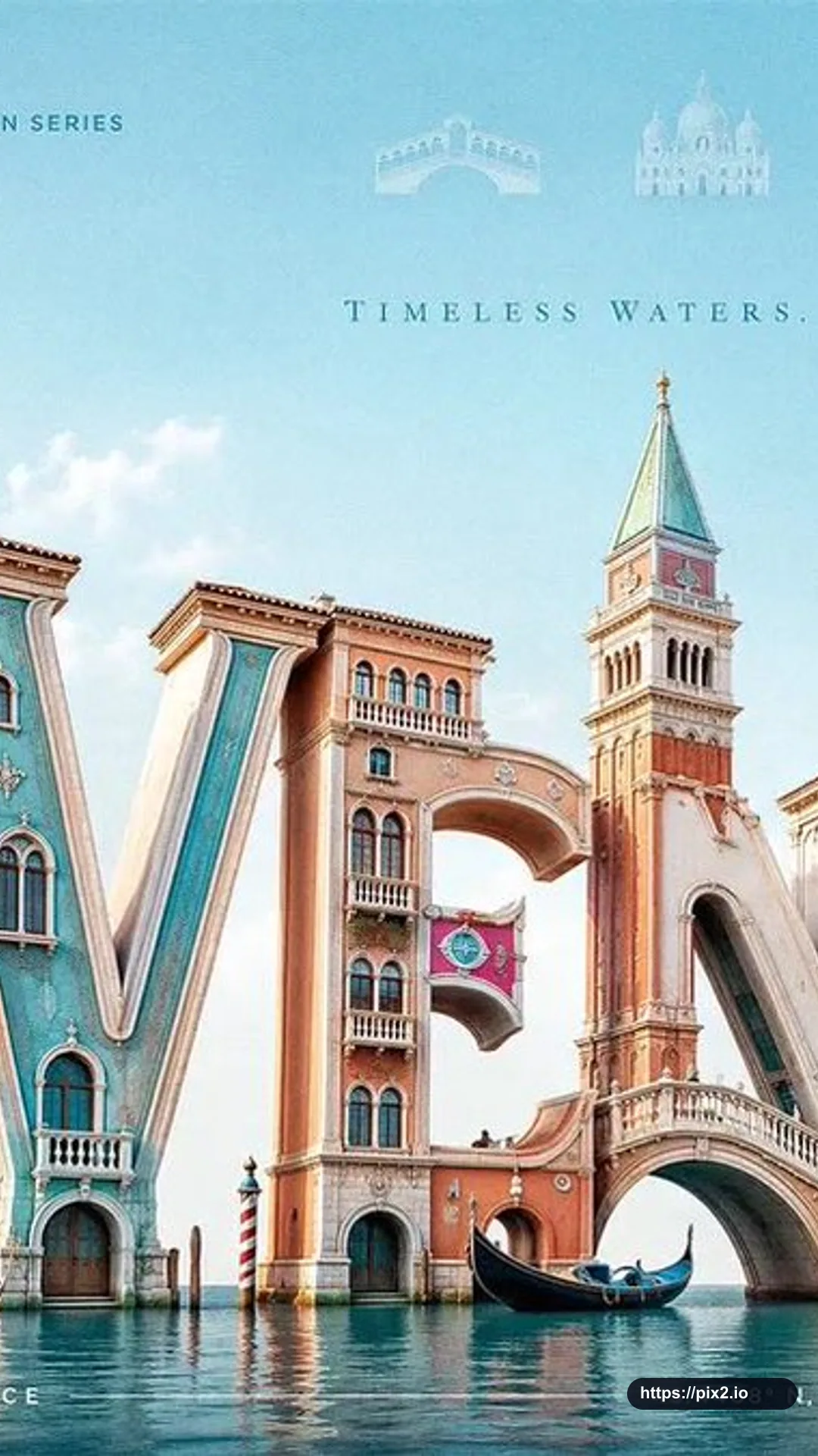
Create a 9:16 premium 3D typography-based travel poster for [City], using luxury editorial destination advertising fused with realistic sculptural letterform architecture. The city name [City] must be the dominant subject, occupying most of the canvas. Build the letters as large, realistic, three-dimensional sculptural forms made from glossy painted material, polished ceramic, soft plaster, carved stone, sunlit architectural surfaces, or materials that fit the city.
Each letter should physically transform into the city's identity: landmarks, skyline silhouettes, arches, towers, domes, bridges, windows, balconies, cultural patterns, coastal forms, or street details should grow directly out of the letterforms. Landmarks should feel architecturally integrated, not pasted behind or around the word. A tower may rise from a vertical stem, a bridge may connect two letters, a dome may form the curve of a rounded letter, rooftops may shape the top edges, and windows or ornamental details may be embedded into the letter faces.
Use a low-angle three-quarter camera view so the typography feels monumental, cinematic, premium, and friendly. Place the 3D city-name sculpture slightly low in the frame, filling the central and lower portions of the poster, with generous negative space above. At the top header, add a refined horizontal row of faded landmark symbols related to [City], using tiny vector icons or translucent architectural glyphs. Add each landmark name below its icon, keeping the row soft, elegant, secondary, and premium.
Use bright natural daylight with a soft key light from the upper left, gentle fill light, clean highlights, subtle ambient occlusion, and soft contact shadows beneath the letters. The lighting should feel cheerful, fresh, and editorial rather than dark. Choose a bright city-adaptive palette: coastal cities use aqua, coral, cream, and sunny yellow; historic cities use warm stone, terracotta, olive, and soft sky blue; tropical cities use turquoise, mango, palm green, and white; mountain cities use alpine blue, meadow green, snow white, and golden warmth; nightlife cities use violet, cyan, peach, and amber.
Add quiet editorial text elements: small uppercase header text such as DESTINATION SERIES, a tiny location code like CITY / 01, delicate vertical divider lines, a minimal footer line such as VISIT [City], and small microtype coordinates or issue number near the bottom edge. These text elements must remain secondary so the large 3D city name stays the hero. Keep the background clean and spacious with only a soft sky gradient, delicate clouds, or an abstract color field. Do not place extra landmarks in the background; the main city identity should come from the typography itself except for the faded symbolic header row. Avoid separate landmark collages, flat typography, cluttered backgrounds, visible sun in the top-left corner, excessive icons, muddy colors, unreadable city names, distorted letters, random gradients, noisy textures, and cheap souvenir aesthetics.

 9:16 ・ 4K