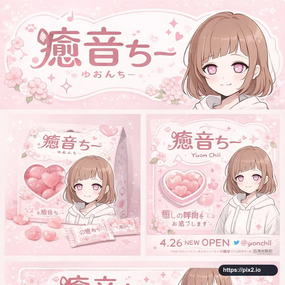
Create a square 1:1 anime character brand identity and merchandise design board. Use a [Theme Color] and white color palette, with [Motif] plus pink hearts as the main decorative motif. The central character is an original anime girl with short brown bob hair, pink eyes, a white hoodie, and a gentle smile. Build a complete brand system around the character name [Character Name] and sub-logo text [Character Subtext]. Arrange the board as a polished multi-section presentation: a top header banner with the large main logo, sub-logo, cherry blossom-style graphics, and the character portrait on the right; a middle-left product-packaging section with one square box, a heart-shaped transparent window showing pink heart candies, the character illustration on the box, two individual candy wrappers, and five scattered heart candies; a middle-right promotional poster with the character portrait, a heart-shaped candy bowl, the main logo, the sample launch text "4.26 NEW OPEN", and the social handle [Social Handle]; a lower-middle horizontal web banner with the main logo, floral graphics, and the character portrait on the right; a bottom-left social media profile mockup with a header image, one circular profile picture, the handle [Social Handle], one follow button, and short mock bio text; and a bottom-right merchandise collection with exactly nine items: one white T-shirt with the logo, one white mug with the character, four round pin badges, one acrylic keychain, and two candy packets. Use soft pastel branding, cute Japanese character-goods styling, clean grid alignment, delicate printed packaging details, readable but fictional display text, and a professional product-board finish. Avoid copying real character IP, real brand logos, real platform UI, real trademarks, QR codes, URLs, or legally binding campaign claims.
Output aspect ratio: 1:1.

 1:1 ・ 4K