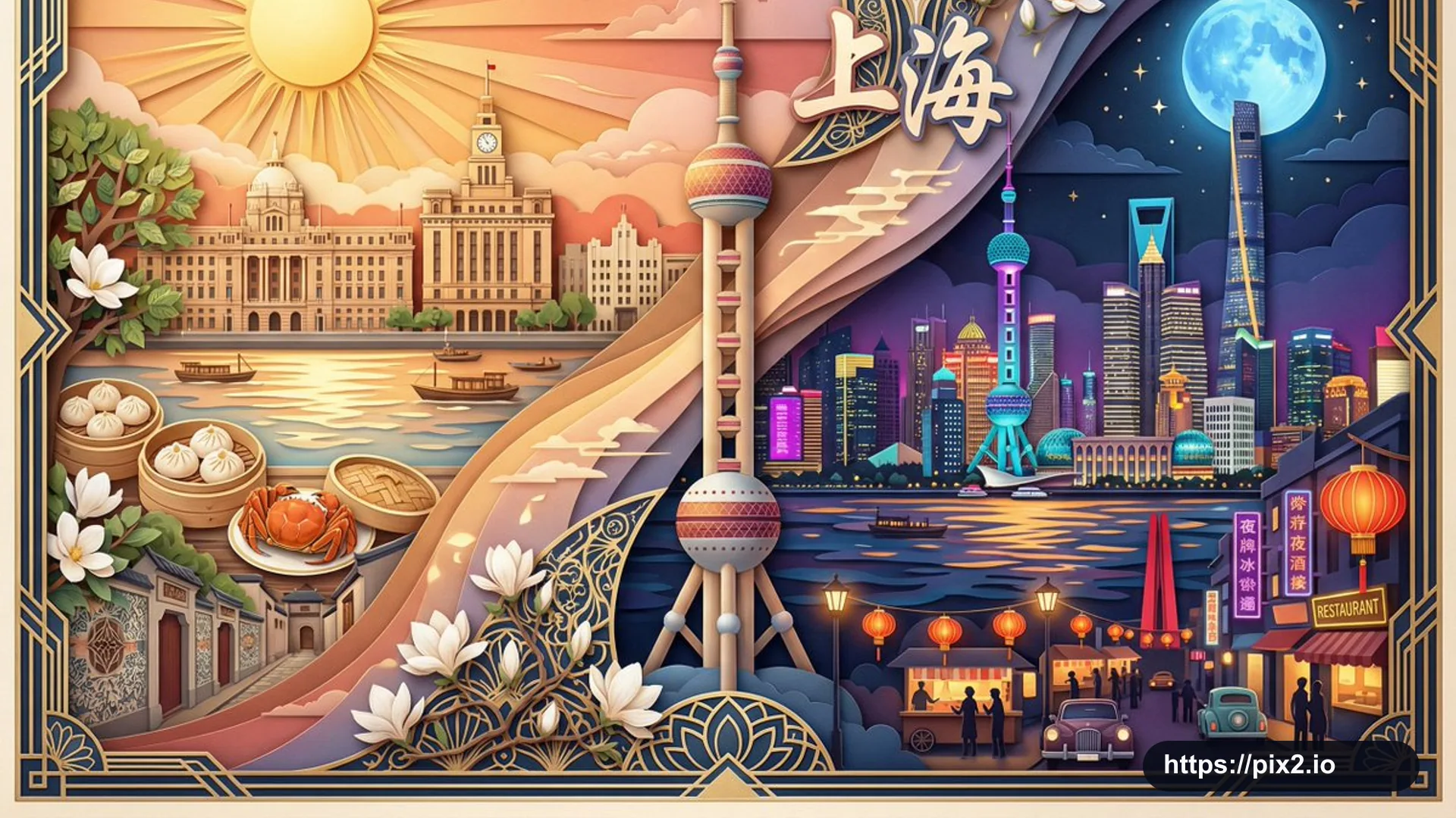
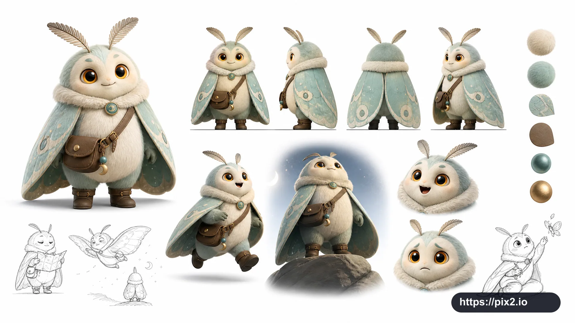
Express [Subject] in a graffiti sketch style. The overall visual effect should feel like rapid sketching, free transformation, improvised hand drawing, and a draft-like design study. Use casual exaggerated lines with varied thickness: slightly messy, rhythmic, expressive, fun, spontaneous, and generalized rather than rigorously realistic or finely detailed.
Use rough dry-brush blocks of color with uneven smears, brush marks, flying whites, and overlapping strokes. Let the color palette adapt naturally to [Subject], while keeping the overall expression graffiti-like, sketch-like, energetic, and simplified. Do not use transparent watercolor smudging, delicate watercolor transitions, paper textures, soft atomization, or dreamlike effects.
Keep the background mostly white space, simple, relaxed, unfinished, and design-oriented. Add a small number of auxiliary symbols, arrows, marks, circles, repeated lines, handwritten words, or other graffiti elements to enhance the sketchbook or essay-like visual language, but keep the layout open and do not crowd the subject. Let [Subject] drive the main image, actions, related elements, symbols, and simplified scene automatically. Add a unique signature reading [Signature] as part of the image, placed discreetly but clearly in the lower-left, lower-right, or near the title. The signature should look refined, restrained, high-end, integrated with the layout, and not too large. Create a horizontal 16:9 composition. Avoid real brand logos, offensive graffiti, extra watermarks, cluttered backgrounds, unreadable main subject, cheap-looking signature typography, over-rendered realism, and low-resolution artifacts.
 16:9 ・ 4K