Express [Subject] in a graffiti sketch style for a wide 16:9 image. The overall visual effect should feel like quick outlines, free deformation, improvised hand drawing, and draft-like sketches rather than rigorous realism or fine detail. Use casual, exaggerated lines with varied thickness; keep them slightly messy but rhythmic, expressive, fun, and spontaneous.
Build the color treatment from rough dry-brush blocks that adapt to [Theme]. Preserve uneven smears, brush marks, fly-white gaps, and visible layering. Do not use transparent watercolor smudges, delicate watercolor transitions, paper texture, soft mist, or dreamy texture effects. Keep the background mostly white space so the composition feels simple, loose, unfinished, and designed.
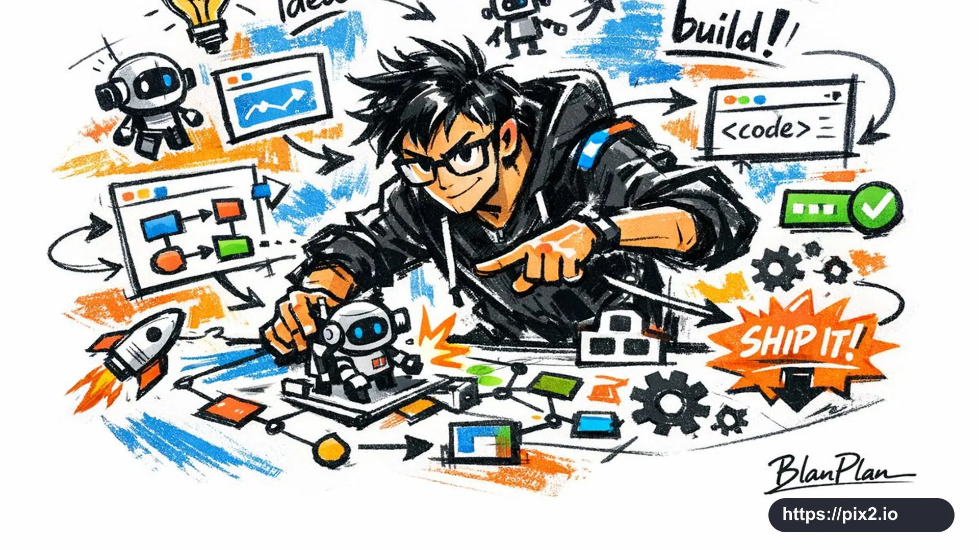
The image content should be inferred from [Character Image]: generate the most suitable main figure, action, related elements, symbols, and simplified scene for that subject. Add a small amount of auxiliary graffiti language such as arrows, marks, circles, repeated lines, sketchbook symbols, and casual handwritten notes, but do not overcrowd the image or destroy the white-space atmosphere. Keep the entire picture unified as an exaggerated generalized graffiti sketch, avoiding complex realistic backgrounds and excessive detail. Naturally include the special signature "BlanPlan" in a low-key but clear position such as the lower left, lower right, or near the title. The signature should feel like a refined artist mark, restrained and high-end, not too large, abrupt, or cheap. Avoid real brand logos, offensive graffiti, extra watermarks, unreadable main subject, overly realistic rendering, cluttered background, cheap-looking signature typography, and low-resolution artifacts.
 16:9 ・ 4K