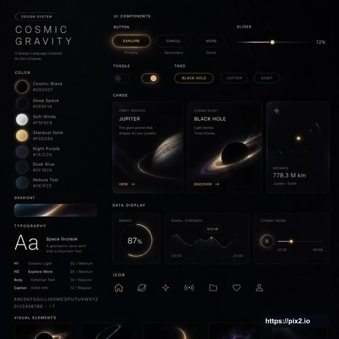
Create a 1:1 square UI design system presentation board in [Visual Style]. Show a complete cohesive design language with labeled sections for web pages, mobile screens, cards, controls, buttons, navigation, forms, tags, toggles, sliders, data displays, iconography, color palette, gradients, typography scale, spacing rules, and visual elements. Arrange the system as a polished product-design board with multiple UI component examples, realistic screen mockups, clean alignment, consistent grid spacing, clear hierarchy, and premium presentation quality. The chosen [Visual Style] should control the palette, lighting, textures, icon motifs, card treatments, button states, typography mood, and illustration accents while keeping the interface usable and modern. Include enough detail to communicate a full design system, but avoid clutter. Use crisp vector-like UI rendering, legible labels, balanced negative space, and high-resolution finish. Do not include real brand logos, copied app interfaces, private information, random unreadable text, broken layout alignment, inconsistent component states, malformed icons, extra watermarks, or low-resolution artifacts.

 1:1 ・ 4K