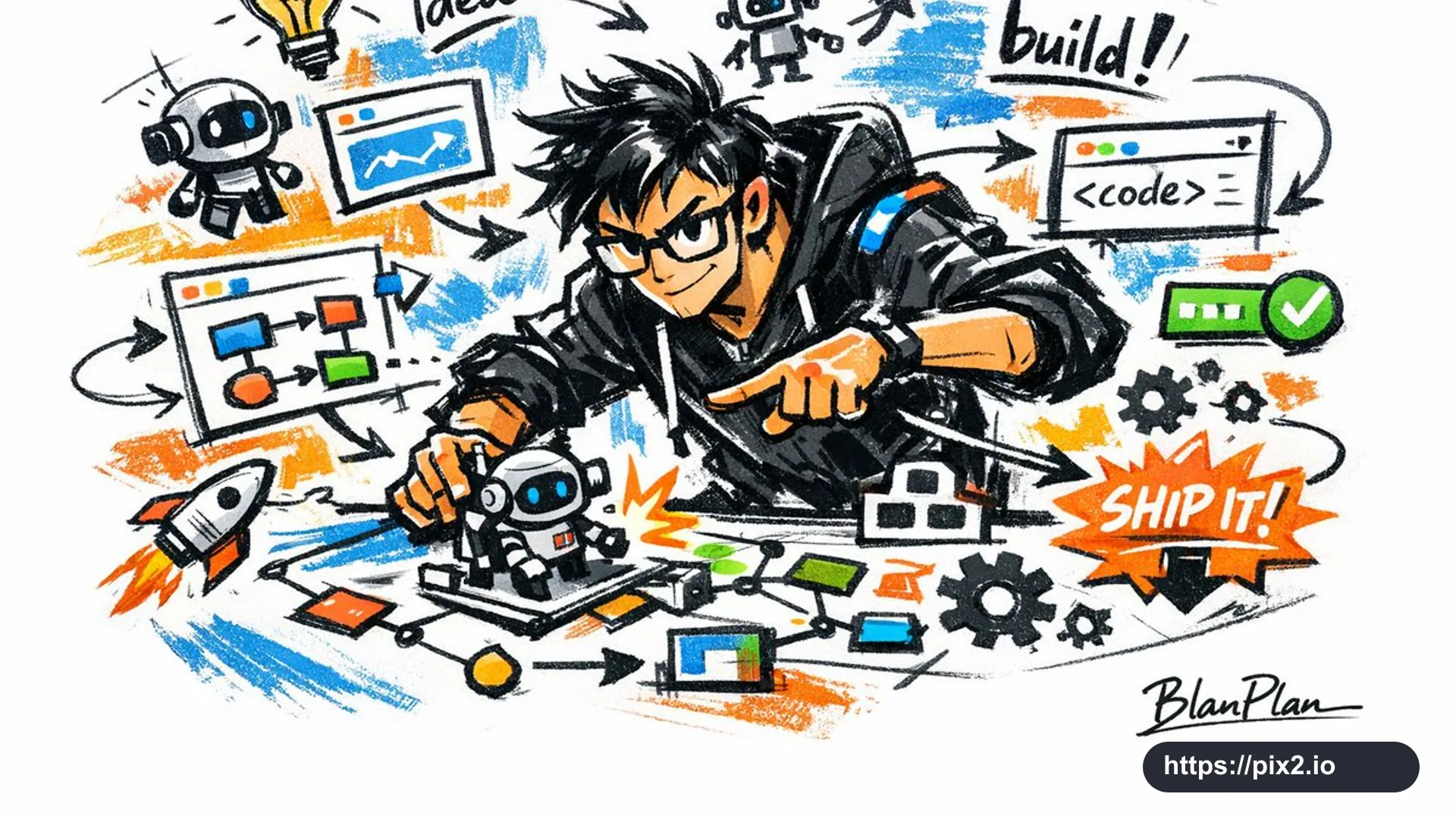
Express [Subject] in a graffiti sketch style. The overall image should feel quickly drawn, freely deformed, impromptu, hand-made, and draft-like. Use casual exaggerated lines with varied thickness; the drawing may feel slightly messy, but it must have rhythm and expressive energy. Emphasize simplification, exaggeration, humor, and spontaneity rather than strict realism or fine rendering. Use rough color blocks with an obvious dry-brush feeling, including uneven smears, brush marks, dry white gaps, and layered paint coverage. Let the color palette adapt naturally to [Subject], while keeping the expression graffiti-like, sketch-like, and summarized. Do not use transparent watercolor washes, delicate watercolor gradients, paper texture, soft mist, or dreamy effects. Keep the background mostly blank, simple, relaxed, intentionally unfinished, and design-conscious. Add a small number of supporting symbols, arrows, marks, circled notes, repeated lines, casual handwritten words, or other graffiti elements to strengthen the sketchbook language, but do not overcrowd the layout or damage the subject and negative-space quality. Let [Subject] guide the most fitting figure, pose, related elements, symbols, and simplified scene. Naturally include the signature "BlanPlan" as part of the artwork, placed low-key but clearly, such as in the lower-left, lower-right, or near the title. The signature should feel like an artwork sign-off: refined, restrained, premium, not too large, not disruptive, not abrupt, and not cheap. Output aspect ratio: 16:9.
 16:9 ・ 4K